Investment Division Portal
Manulife Asset Management Portal - Launched 2018
The PROBLEM
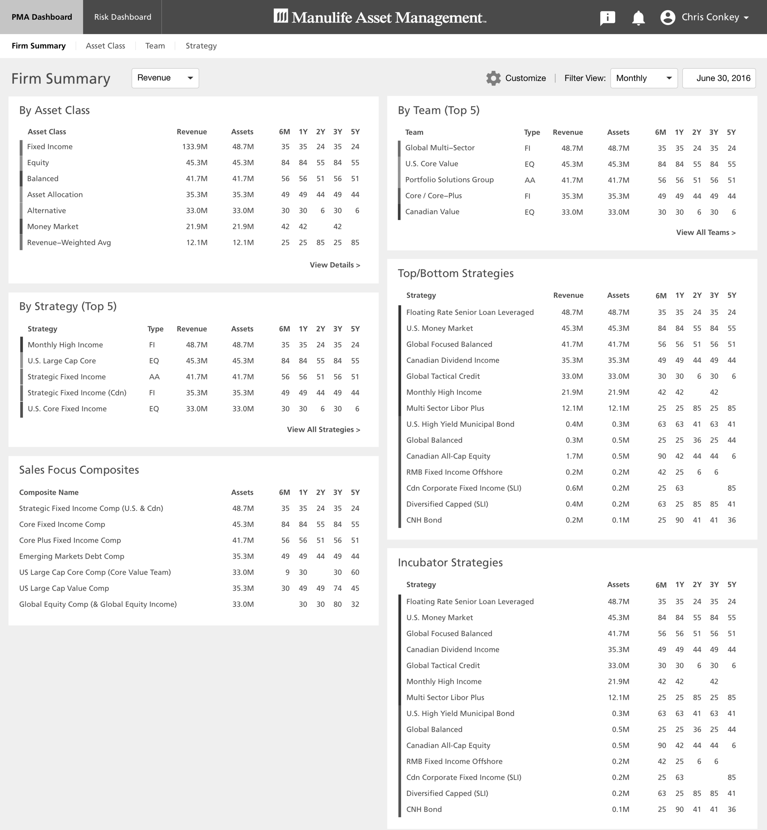
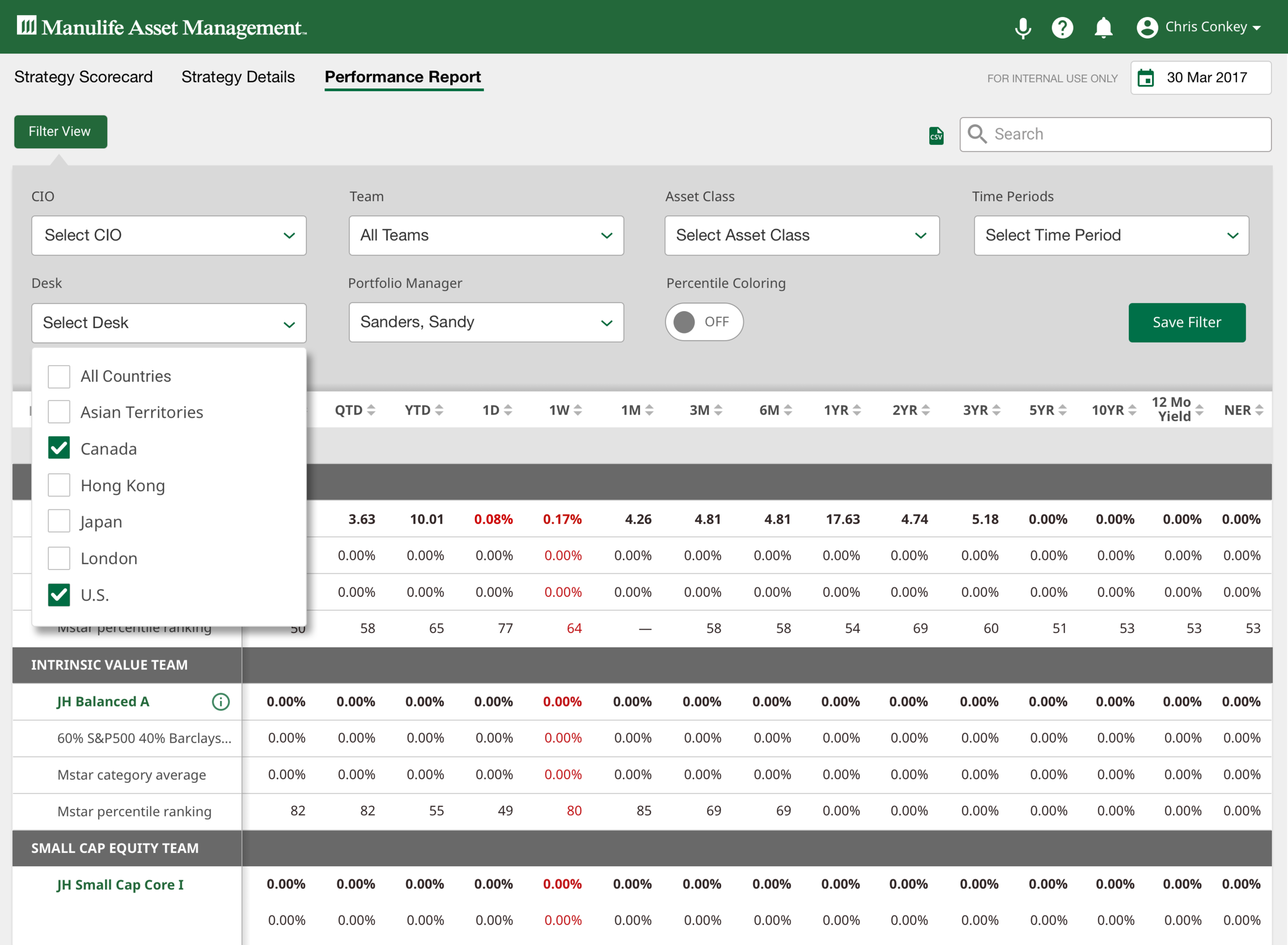
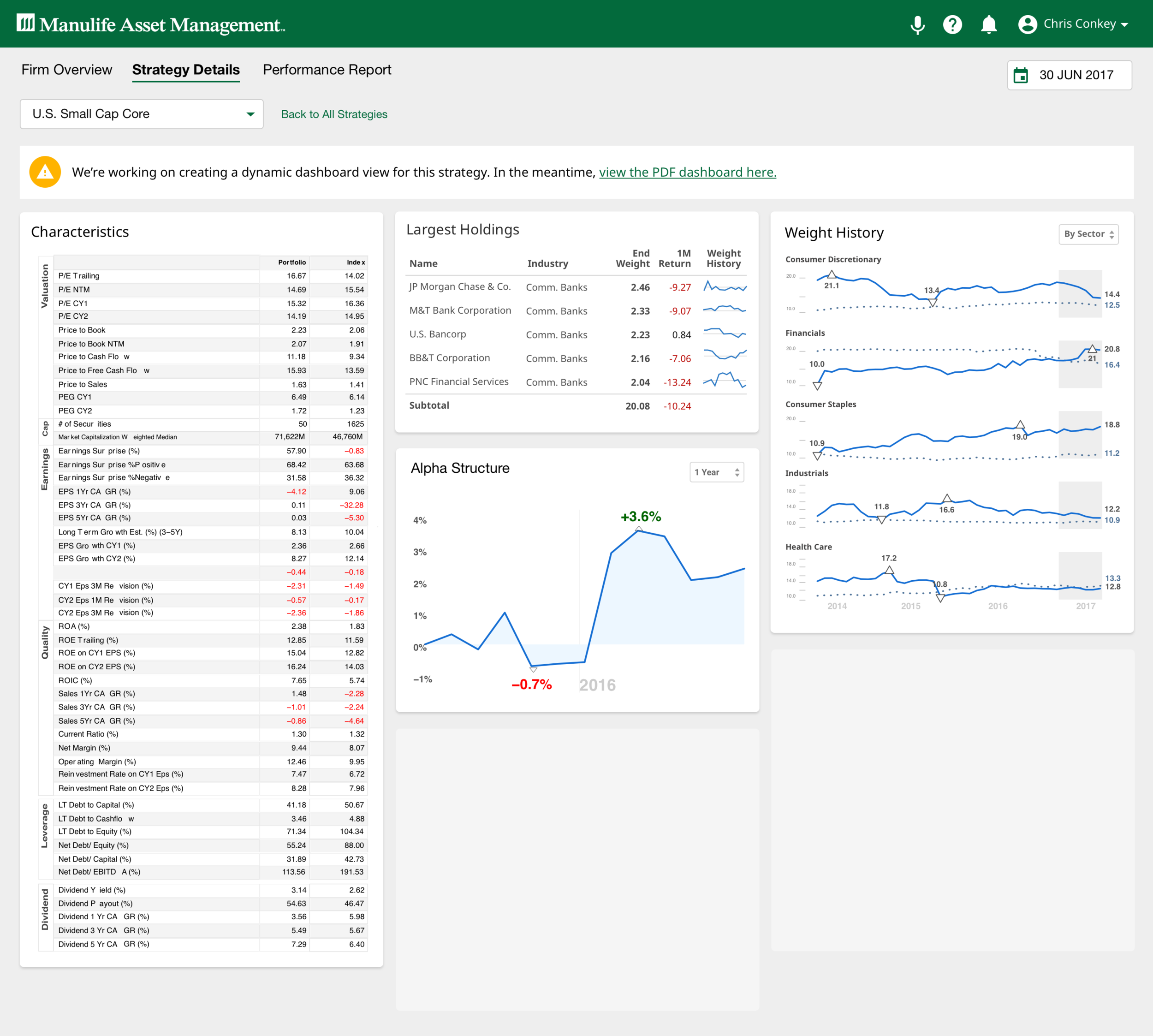
For years, the Chief Investment Officer, his directs, analysts and portfolio managers across the organization have accessed performance reporting and measurement via daily and monthly PDF reports. The ask was to improve the employee experience by giving these stakeholders the ability to view fund data on a daily basis in a more accessible and dynamic way.
Solution
A portal that allows for digital access to all performance reporting and portfolio attribution for Manulife/John Hancock. As its primary goal, we created a single point of access for this data globally and materially reduce/eliminate the significant number of performance/portfolio attribution currently produced.
DEFINE
My first week at the company, I was given a challenge to digitize hundreds of pdf reports received by analysts, portfolio managers and the chief investment officer for the company.
Before starting to jump into solutioning, I knew we had to dig deeper into the issues these users were having with the current process. Being new to the company, I also needed to discover what it was that each of these users did for their jobs.
We were able to narrow down our scope of users in this phase of the project and started at the top with the CIO.
DISCOVER
I started talking to portfolio managers, the analysts and the CIO, asked a lot of questions and analyzed every piece of data I could get my hands on.
Working with my product manager, he and I assembled stakeholder interviews and began meeting with each of the users to dig further into their daily workflow. We also sat with portfolio managers and the data analysts to observe how they managed their work and the tools that enabled them.
From our interviews and observations, the project team assembled personas and we were able to map out users journeys highlighting actions, questions, pain points and opportunities.
DESIGN & Prototype
Once we understood the problems and had a full understanding of their process, I started sketching solutions and rapidly receiving feedback from the team and stakeholders.
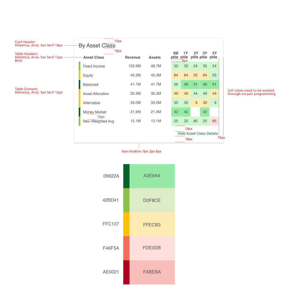
Using Sketch, I began wireframing responsive dashboard layout options for a tablet and desktop. Without worrying about component styling and visual design, I built a low-fi prototype using Invision to begin receiving feedback and observe how users were able to use the product.
We continued iterating on wireframes and lo-fi designs, testing in Invision until we were comfortable building out the basic building blocks for the application. From there, I worked with our engineers to bring the components of the interface to life for a beta release.